The conversation in which the late great Robert Hughes refers to Andy Warhol as “one of the stupidest people I have ever met in my life” takes place in the extreme comfort of an American private collector’s apartment, and also provides us with Hughes’ justification: “he had nothing to say.” The collector responds: “well he didn’t have anything to say verbally, but he said it all with his work,” almost in-line with Warhol’s own pronouncement: “just look at the surface of my paintings and films and me, and there I am. There’s nothing behind it.” Almost, because Warhol sneaks in “and me”, “look at me too,” of course he would, so the collector’s attempt to hide the unsightly Person of Warhol goes nowhere fast.
But surely something has to be more than surface to be in a museum. A more effective use of the “imagery of the marketplace” than in Warhol is to be found in the marketplace, and at much greater frequency with much more variety, making the marketplace itself a better Warhol than Warhol. The question of why Warhol’s stuff is more than just a bland advert for Campbell’s soup (and I bet Campbell’s sales are much higher for them) is countered by that ever-strong, chess-opening-like countermove “because it is in a museum, Duchamp etc.”, so we are left with mental contortions that kind of hang in the air without ever really roosting: ‘the art that he called ‘pop’ challenged and teased the art establishment, because it embraced commercialism, made ‘high-art’ out of the banal… Ironic, iconic, superficially lightweight, profoundly subversive while remaining resolutely on the surface of things.’
This last quotation from the Dulwich Picture Gallery’s accompanying leaflet is one of the many ways of saying to Robert Hughes “he was only pretending to be stupid, so as to better lampoon! He turned the weapons of commercial activity back at the power structures themselves!” Which is in turn countered by the following paratextual elements on the exhibition’s leaflet (there is no catalogue): “Andy Warhol, The Portfolios: The Bank of America Collection”; “Made possible by Bank of America Merrill Lynch”; “Media Partner squaremile.com”. If Warhol’s portfolios are indeed weapons then they are now the assets of the Bank of America, and short of their having a 50 year explosive fuse they seem to be distinctly unrevolutionary in their being pretty price-stable investments for a large bank.
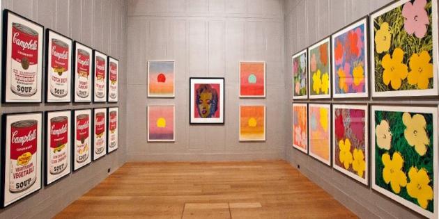
This is not the beginning of a rant, it is a pointing out that the Dulwich Picture Gallery’s Warhol show is the perfect way to see Warhol. Whatever you think of art, whatever your taste, Warhol is now the almost universal question, and the Dulwich show’s minimal curation and lack of “angle” (they are just hung on the wall in their sets, no expansion other than title and keeping approximate chronological order) present Warhol as a pure question. You walk into the Dulwich Gallery building, freely past the Poussin exhibition, are freely met with Guido Reni’s St. John the Baptist in the Wilderness and Saint Sebastian, then turn left , give your ticket to a guard securing the cordoned off area, and are met with a technicolor Marilyn Monroe: question one. Question two: you read about how this exhibition of subversion was made possible by the Bank of America. Question three comes when you realise that the Campbell’s soup cans are actually exactly the same- there is no spot the difference with fine detail to be played- the only difference between them is the extremely obvious one: that the cans just indicate different flavours. So where I had been looking for inconsistencies in the screen-print, like a dint in a can of soup, there was absolutely none; but where I hadn’t really clocked the difference before, there it was- plain to see.
The Dulwich show in this way forces you to pay attention to obvious surface. It is a show concentrating on a part of Warhol’s output while implying a vast number of works available but not present in this outing. The exhibition space consists of two small-ish rooms linked by a corridor, which has the effect of pressing you very close to these gaudy pieces. So here is what I discovered: the screen-prints really are identical, which is a miracle of quality control, I think, rather than technical ability. They are absolutely chaotic- no thought has been given to composition, the only composition comes with colour. Further to this, Warhol is not a great colourist (I have heard some say that he is in the Matisse tradition). Warhol has only one trick: contrast. The mission is to make each colour bolder and starker by association with any other colour as we can see in Space Fruit: Still Lives (1979) and Vesuvius (1985).
Hughes is right. He is stupid. There is nothing remotely clever about him. There is nothing to talk about, which is why people who write about art are forced into writing about culture (as in Cultural Studies) when Warhol pops up. But I think Hughes is wrong to dislike Warhol- I think Hughes falls into the trap that another set has fallen into with Pete Docherty: the muddling of a dislike of the person with a dislike of people who like them or their followers. Pete Docherty is fine by me, he can do what he wants. People who like Pete Docherty, on the other hand, are an absolutely wretched crew, and bring the average name of Peter Docherty into disrepute. Those who hung around Warhol’s Factory- the waifs and strays and nothings that flocked to Warhol’s brand of blank cool- make a similar phenomenon (with the exception of The Velvet Underground).
If we look at the red version of Vesuvius we can start to unravel its cause. This is a screen-print of a photograph of a mountain, and this time Warhol has chosen bright red. I am so glad Dulwich have this on show, because it is a perfect piece to examine Warhol’s entire thing. The volcano is erupting, and Andy Warhol’s response to an erupting volcano is to use the same red for the volcano as is used for a throbbing blister on the foot of a cartoon dog after it has been hit with a cartoon hammer. That’s it- there is no comment. He doesn’t subvert the language of commercialism, or whatever he is meant to do to what language, he just makes a cartoon of it. That is, to use it louder and bolder and more insistently than anyone else, even the marketplace. His soup cans are not “more” than the real soup cans, nor are they “subverting” the original soup cans, but against their white background and at many times the size they are much more insistent. (You might object that his wonderful Flowers (1970) series does not conform to this. I would say that it does, but so do real-life flowers, making Warhol’s process is less obvious. The job of flowers is to shout and decorate).
This is the art of Warhol. If you take his sunglasses off you see a child that repeatedly makes his first adult joke. He means nothing at all. His response to a volcano erupting is the visual equivalent of screaming “A volcano is erupting! A volcano is erupting! A volcano is erupting!” Warhol on soup cans? “Soupcanssoupcanssoupcans!!!!” He takes on mythical subjects in room four of the Dulwich show, and never gets beyond saying “these are some myths”. This is a child- the adult part comes because Warhol figured out that if you wink at the end of your screaming then something would happen in the adult world. And the adult world is still calling this wink-in-the-dark “profoundly subversive”. Then this hint of irony has proceeded to run away with itself, as it tends to do. The simpler the thing the more layers of irony and counter-irony attend it, until the presence of all this irony has by now become the aesthetic/philosophical act being lauded. Warhol is not a great thinker or wit; all that it takes is to watch an interview with him and allow that he might be stupid.
But this meaning of nothing-truly nothing at all, ever- is his amazing and singular gift. Warhol is not vacuous- his is not an absence of meaning, it is a meaning precisely nothing. He speaks, and nothing happens, in the way of Terry Pratchett’s formula: “In the beginning was nothing, which exploded”. There is not an absence of meaning here, it is an active meaning nothing. Space is not “nothing”, or absence: it’s full of Space. Warhol’s screen-prints are not “nothing”: they are soup cans. And what do soup cans mean? Nothing, but they’re not empty, they’re just soup cans.
Similarly, anything could be part of Warhol’s art and nothing had significance: soup cans, flowers, Muhammad Ali, Marilyn Monroe, volcanoes, fruit, were all treated exactly the same way. Nothingness is not a political act. However, he has acted from the beginning as a flycatcher for those who poke politics into every nook of his work because, basically, art has come to be judged by what it can claim to subvert. Part of Warhol’s sunglasses, shrug and wink was to let them see what they needed in order to sell him.
In this way Warhol is not pretentious- he had no pretensions towards anything other than shouting out things as he took polaroids of them, or shouting himself in a kind of awkwardly brash, Simon Cowell way. The people who hung around The Factory, however, were pretentious, using the blank figure of Warhol to structure their cool, boring eccentricity, and always looking around at Warhol to see if they were “doing” louche or counter-culture quite right. Where Warhol meant nothing, his followers used him as an antidote, or shrink, against their own personal existential nihilism- to fill a vacuum or want or unknown that Warhol didn’t feel. This is how you make a cult, and how you get shot by a devotee called Valerie Solanas on June 3, 1968 who said that Warhol “had too much control in my life.” Warhol never had an analyst.
My argument rests, then, on one assertion: Andy Warhol would not have hung out at The Factory, if The Factory were owned by someone else. Warhol’s mind was not the kind of mind you would find in The Factory. His success and continued merit is due to his singular nature, which also eclipses any possibility of heirs or imitators. He is exactly what he is, which is why to name someone “The New Warhol” is to produce a contradiction in terms. There can never be a new Warhol, because then, at the very least, their work will “evoke” Warhol’s nothing, whereas Warhol’s work just was soup, or volcanos. Saying something to signify nothing is a great artistic achievement, and a tale only an idiot could tell. It was quotidian stuff, containing everyday things- but my days are not meaningless, they just don’t have a transcendental or political meaning.
The effect of Warhol, unbeknownst to him, is that he has ended up pointing this out: rows of soup cans on a supermarket shelf are suddenly Warhol-esque. Other Warhol-esque things might include faces on loads of out of circulation coins, 20s/30s advertisements (“Keep Calm and Carry On”, plus permutations), or, maybe, certain flowers. Any “New Warhol” falls into this category, which is not necessarily due to direct referencing, but because Warhol has already announced his monopoly on the face-value, the precise repeat, the commercial, and the meaning nothing, which is like adding a new adjective to our language. He stands for face-value commercialism; or rather, where there was before an unexpected, ill-defined and -mapped, face-value commercialism, we can now talk about Andy Warhol. This un-political show of a corporate collection strikes me as the perfect way to see Andy Warhol, in that it raises certain questions about and around him, but doesn’t have people leaning over your shoulder telling you that he, himself, knew or answered any of them(, or that there is some big joke to get. And the threat that there might be a joke you haven’t got yet is one of the biggest obstacles to public engagement with “Modern” art).
Andy Warhol: The Portfolios, Dulwich Picture Gallery. 20 June 2012 – 16 September 2012
**** 4 Stars Words by Jack Castle
Visit Exhibition Here