Edwina Leapman, Annely Juda Fine Art, 28th February – 28th March 2013
Monochrome really belongs to Yves Klein, but as Edwina Leapman was also a devotee in the 1960s, at first glance these ‘New Paintings’ from 2012 are down that similar and well-trodden path. But Edwina Leapman and Annely Juda beg to differ, and as you settle yourself infront of one of Leapman’s canvases – which in reproduction look more like coloured asemic writingon a coloured page – you notice they are not quite monochrome, and in the “not quite” is where these paintings hide their power.
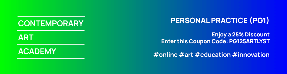
Edwina Leapman, Untitled, 2012, acrylic on canvas, 167 x 167 cm
We all know that water is darker where it is deeper, and this can affect our looking at paintings which use subtle changes in tone and shade – i.e. we read dark patches of paint as moving or sloping backwards within the same field, and this is true of Leonardo’s sfumato as it is with Ordinance Survey maps. But Leapman’s idea is to change, very subtly, the actual colour that in turn seems to move around the colour field. Parts of her blue aren’t darker blue, they are more purple; a slightly different colour rather than variations on the same colour. So instead of an illusion of depth – as with dark and light patches of water, and what we initially expect from a painting – the changes in colour create different objects (for want of a better word – perhaps “areas”), the same way as you’d use a different colour for the flowers to the vase.
Using different colours for different things is the most basic of all painterly tricks, so basic it is hardly a trick, it’s just painting, but the only just perceptible difference in colour that Leapman employs occasionally seems as though we are looking into something with depth, whereas actually we are looking at a flat surface with different colours and forms on, laid in a syncopated rhythm of different objects rather than the rhythm of eddying water rising and falling (which is just one form with a predictable movement). I think this is what she means when she says that ‘the colour sensations are used to move the surface of the ground spatially, and this causes perceptual shifts by colour, making an equal tonality.’ The equal tones make the painting flat, but the confusion between eye and brain makes you see a painting with unpredictable movement and rippling contours that yet is wholly still. Leapman’s work is not of this world, is not 3-D, but you expect it to be: the still movement created in the not-mountains and not-waves. When we normally say paintings move, we usually say so even though it is obviously still; here we have to say Leapman’s paintings are still, though they obviously move.
Robi Walters, Waterhouse & Dodd, 6th March – 28th March 2013
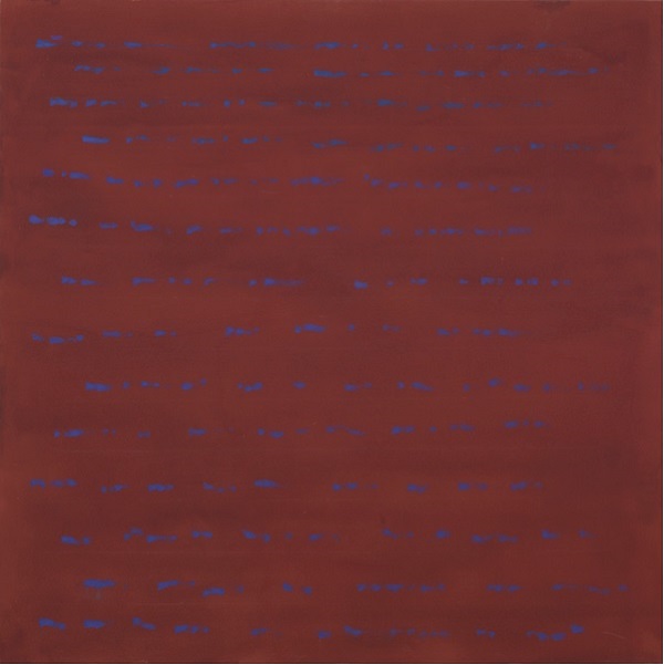
Robi Walters, Move On Up, collage on board, 183 x 122 cm
Another exhibition highlighting the engrained tricks of the Renaissance is on show at Waterhouse and Dodd, Cork Street. These works are from an open-ended series of works that Walters refers to as ‘Kaleidacycle’. Inspired by ‘the chakra system, which is the spinning colours of light in different positions of the human spine’, he takes household waste (amusingly, one of these pieces seems to use a Waterhouse and Dodd catalogue cover), cuts it into petal shapes and makes work in which each petal goes to creating a kind of flow from a central flower/node which, to Walters, ‘represents the connection between the physical world and the infinite.’
Because each piece is a ‘petal’, and the centre is a ‘flower’, you immediately think of the regular order of petals around a flower, and as you follow the flow out away from the centre, you expect a continuation of this perfect order in which the petals flow in a regular Fibonacci spiral – a result of the equation that links biology to mathematics to aesthetics and was taken by the Medieval and Renaissance mind as evidence of a divinely ordered world. The reality of Robi’s connection between the physical world and the infinite, however, is one of a quick loss of order into a flux of petals branching in all directions. The order is lost to an approximate flow, which disappears into the edge of the board after less than one loop. The physical world seems still to have some unfinishable work to do.
Mat Collishaw: This Is Not An Exit, Blain|Southern, 14th February – 30th March 2013
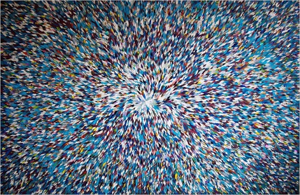
Mat Collishaw, installation shot. Photo: Peter Mallet
Similarly, Mat Collishaw does not provide us with an exit, choosing to plaster the walls of Blain|Southern with enormous canvases that recreate in oils an extremely zoomed in look at folded sheets of paper with traces of white powder still in them, leftovers from their days being used as “’wraps’, used to package and distribute narcotics.” Collishaw has made a career by investigating our innate responses to what we see – prejudices, ideologies, etc. – rather than what we see itself. This unusually moralising exhibition (‘drugs aren’t an exit, man’) uses the empty wrap/filled canvas opposite that is meant to visually display our present emptiness or nothingness, prodding us into vaguely “anti-banker” sentiment by using names of ‘gentleman’s clubs’ as titles and making sure that ‘the excesses of capitalism and the over-stimulation of consumerism that precipitated a culture of greed and, subsequently, the economic crisis of 2008, are referenced.’ Although Collishaw seems to labour under the charmingly naïve misapprehension that only bankers and men take drugs, these paintings are interesting for their full-zoom into very small and fine areas of magazines and the textures of folded paper, and this magnification is probably better and more interesting than the presence of a not unnoticeable amount of cocaine. The second room especially, where excerpts from magazines are magnified to the point of being nearly surreal, bear some resemblance to Jenny Saville’s work in showing the oddness already in reality (or “reality”, if you prefer it in scare quotes) if you look closely and magnified enough.
John Bellany: Epic Journey through Life, Beaux Arts London, 6th March – 6th April 2013
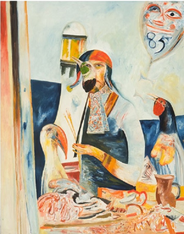
John Bellany, Self Portrait (The Artist Holds the Bird of Paradise), 1985, Oil on canvas, 152.5 x 122 cm
As supplementary to, or to capitalise on, John Bellany’s just-finished retrospective at the Scottish National Gallery, Beaux Arts has another Bellany retrospective covering a period running from the mid-1970s to last year. It is necessarily sparse owing to the difference in size between the Scottish National Gallery and Beaux Arts Cork Street, but there is still a lot of Bellany here, focusing particularly on the early 1980s more scratchy, de Kooning style work, the subsequent offerings that seem to owe more to Munch, and the most recent watercolours – painted after the artist’s move to Tuscany – that are bright, joyous landscapes full of the sun and the ochre of that place.
There is also a nice amount of self-portraits here in Beaux Arts that serve as an anchor to the style changing around the face. In particular the large 1976 self-portrait (on the left as you walk in) compared to ‘Self-Portrait (Artist Holds the Bird of Paradise)’ (1985, downstairs room in the middle) make a nice contrast, where the younger artist paints himself symbolically as a kind of rock or geological feature – part of the land – or perhaps as some odd Scandinavian minor deity (plus already the quite dry scratchy oil of the early 80s), as opposed to the ’85 version, which is more Expressionist than symbolist and shows a signature way emerging of dealing with Celtic/seafaring influences: i.e. not through symbolism or mysticism, or (like Lanyon) treating the Celtic-ness of the land like an essence to be captured through abstraction, but as a language with which to see and understand the world – the filter through which to look, and from which the ‘Expression’ part of his Expressionism comes from.
Bellany has claimed that he set out to ‘paint in Scots’. This is probably unhelpfully nonsensical as a way of reading the paintings – though it is certainly worth its salt as a manifesto – but these paintings do at least show beyond doubt that Bellany looks at his subject through Celtic-tinted glasses, but sees the subject rather than the myth. A criticism of W.B. Yeats’ Celtic inflections (that I have heard attributed to Brendan Behan), is that in his love for Cuchulain etc. he ‘absolutely missed the point’ – that to Yeats Ireland was a collection of symbols rather than a country or, importantly for Ireland, a real political matter in the present. Bellany, especially as his work matures, might use Scots, but it is always as a means not an end. He paints in Scots; he doesn’t paint Scots (whereas Gauguin painted Tahitian) – and therefore falls on the good side of the net dividing localism and exoticism . Scots is a language, not a subject. Also, ‘Death Knell for John Knox’ (1990) looks like a good buy for someone with more money than I.
Words by Jack Castle © Artlyst 2013
Top Photo: Mat Collishaw (Detail) Sinners, 2012