
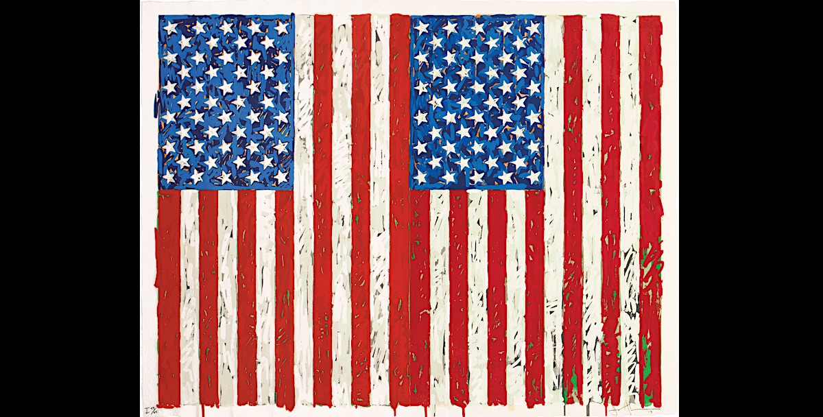
A print by the American Pop artist Jasper Johns depicting an American flag has been donated to the British Museum. Jasper Johns’s Flags I (1973) was gifted to London’s most popular Museum by the New York-based collectors Johanna and Leslie Garfield.
This is a hugely important print – Catherine Daunt Curator
The print is valued at $1m (£770,000) making it one of the highest-priced modern prints donated to the institution. “This is a hugely important print,” said Catherine Daunt, a curator of modern and contemporary art. “It is beautiful, complex and technically a great achievement. We now have 16 works by Johns in the collection, all of which are outstanding in their own way, but visually this is undoubtedly the most spectacular.”
“As the country heads to the polls in just a few days’ time, this important acquisition reminds us of the global influence of the United States and how crucial it is for an institution like the British Museum to collect contemporary works from America.”
The British Museum hold one of the best archives of American prints in the world. The Johns’ print was featured in the museum’s 2017 exhibition The American Dream: Pop to the Present and is a fantastic addition to the BM collection.
Jasper Johns said in a 1978 interview; ‘To me, the flag turned out to be something I had never observed before,’. ‘I knew it was a flag and had used the word flag, yet I had never consciously seen it. I became interested in contemplating objects I had never before taken a really good look at. In my mind that is the significance of these objects.’
Executed in 1973, Flags I is a masterpiece of Johns’ prolific 50-year career as a printmaker. Larger than usual, and rendered in rich, multi-layered colour, the work has been praised as the most painterly and vivid of all his silkscreen works.
Introduced to the silkscreen by Andy Warhol in 1960, Johns was initially uncertain as to whether it would suit his work: a process designed to generate broad areas of flat, single-tone colour was not an obvious choice for an artist whose compositions regularly engaged a juxtaposition between transparency and opacity. However, by 1973, Johns was deploying it with such technical expertise that he was able to convey certain painterly nuances and subtle complexities that were out of reach of even his hand-painted compositions.
With the help of master printer Hiroshi Kawanishi at Simca Artist Prints, Inc., Johns devised a series of 31 screens used in five stages that allowed him to create a richness and depth of colour rarely seen in silkscreened works.
‘By adding a rather large number of screens and having the stencil openings follow the shapes of brushstrokes,’ the artist explained, ‘I have tried to achieve a different type of complexity, one in which the eye no longer focuses on the flatness of the colours and the sharpness of the edges. Of course, this may constitute an abuse of the medium, of its true nature.’
Employing a range of painterly marks — from short, rough gestures to layered hues and lush drips of pigment — he collapsed innumerable chromatic layers into one smooth, refined surface. Intense shades of red, white and blue are enriched with under-layers of green, orange and grey.