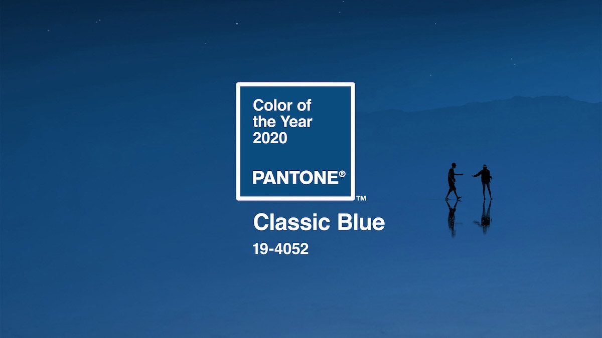
Classic Blue has been chosen by Pantone as the 2020 colour of the year. The hue is elegant in its simplicity. Suggestive of the sky at dusk, the reassuring qualities of the thought-provoking PANTONE 19-4052 Classic Blue highlight their desire for a dependable and stable foundation on which to build as the company cross the threshold into a new era.
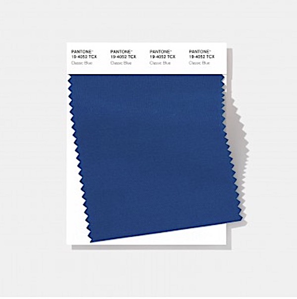
A timeless and enduring blue hue, PANTONE 19-4052
Imprinted in our psyches as a soothing colour, PANTONE 19-4052 Classic Blue brings a sense of peace and tranquillity to the human spirit, offering refuge. Aiding concentration and bringing laser-like clarity, PANTONE 19-4052 Classic Blue re-centres our thoughts. A reflective blue tone, Classic Blue fosters resilience.
As technology continues to race ahead of the human ability to process it all, it is easy to understand why we gravitate to colours that are honest and offer the promise of protection. Non-aggressive and easily relatable, the trusted PANTONE 19-4052 Classic Blue lends itself to relaxed interaction. Associated with the return of another day, this universal favourite is comfortably embraced.
For over 20 years, Pantone’s Color of the Year has influenced product development and purchasing decisions in multiple industries, including fashion, home furnishings, and industrial design, as well as product packaging and graphic design.
The Pantone Color of the Year selection process requires thoughtful consideration and trend analysis. To arrive at the selection each year, Pantone’s colour experts at the Pantone Color Institute comb the world looking for new colour influences. This can include the entertainment industry and films in production, travelling art collections and new artists, fashion, all areas of design, popular travel destinations, as well as new lifestyles, playstyles, and socio-economic conditions. Influences may also stem from new technologies, materials, textures, and effects that impact colour, relevant social media platforms and even upcoming sporting events that capture worldwide attention.
The Pantone Color Institute is the business unit within Pantone that highlights the top seasonal runway colours, selects the Pantone Color of the Year, forecasts global colour trends, and advises companies on colour for product and brand visual identity. Through seasonal trend forecasts, colour psychology, and colour consulting, the Pantone Color Institute partners with global brands to effectively leverage the power, psychology, and emotion of colour in their design strategy.
The Colour of the Year is now an institution eagerly awaited by the design community. The selection of Pantone’s colour experts. Pantone was founded in the 1950s as the printing company in New York but is now based in Carlstadt, New Jersey. Since 2000, it has chosen a colour of the year decided from trend-forecasting research performed by the Pantone Color Institute.
The annual colour, which is announced each December, is chosen based on “what is taking place in our global culture at a moment in time”.
Last year’s colour was Living Coral. Ultraviolet was chosen as Pantone’s 2018 colour of the year