The De La Warr Pavilion is presenting an exhibition of Peter Blake’s Alphabets Letters & Numbers, comprising three print series, Alphabet (1991), An Alphabet (2007) and Appropriated Alphabets (2013), and a personally chosen selection of related original artworks. It forms part of the De La Warr Pavilion’s concurrent programme of exhibitions exploring language, typography, and design.
Throughout his career Blake has created several series of works based on the alphabet related to his enduring interest in childhood innocence and nostalgia and Victorian and Edwardian graphic illustration. Using vintage cards, magazines, books and other found ephemera, he assembles collages that are at once whimsical, humorous and intriguing.
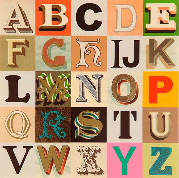
The 26-piece silkscreen print series, Alphabet (1991), manifests Blake’s fascination with pop culture through works such as B is for Boxer depicting Joe Louis, world heavyweight boxing champion (1937-1949), one of the artist’s cultural and sporting heroes; I is for Idols, a collage of screen legends, artists, and musicians including Francis Bacon, Shirley Temple, Laurel & Hardy, the Beatles, Marilyn Monroe, and Tony Curtis; O is for Ornithology featuring a collage of educational postcards of domestic canaries; and U is for Unusual People bringing together images from an earlier politically incorrect era, of performers, circus acts, Siamese twins and others with rare physical deformities.
The 2007 series An Alphabet, is a visual feast of found imagery and typography. Each work contains a centrally placed large letter in a unique typeface, schoolbook calligraphy exercises, and an Indian alphabet letter. The prints vary according to the letter, with dozens of different letter forms, lists, vintage illustrations of animals and objects, semaphore signs, flags, morse code and photographs. Letters from illustrated children’s alphabets lend an air of longing and melancholy, perhaps related to Blake’s sense of having missed a normal childhood by being evacuated during World War II.
Appropriated Alphabets (2013) presents twelve individual alphabets including Appropriated Alphabets 2, a bus ticket collected by Blake from a trip to Utah during a visit to his daughter Liberty; Appropriated Alphabets 3 compiled from the first letters of various font names, and Appropriated Alphabets 5, a playful stencil of his favourite typeface of the same name.
Alphabets Letters & Numbers also includes a selection of works in a diverse range of media demonstrating Blake’s use of text and numbers in a wide variety of styles and contexts, including historical alphabet samplers from the artist’s own collection.
Blake’s interest in letters and typography began whilst studying Art at Gravesend Technical College (1949-51) where he was given a thorough grounding in a wide range of crafts including Roman lettering, hand lettering, typography, and typesetting. The training has had a strong influence on his work with text often forming an integral part, or lone element of a print, a collage or a painting. Blake began using found letters and commercial lettering in the 1950s and allied himself with decorators, sign painters and commercial artists rather than the fine art establishment. – Willem Sandberg: from type to image (until 3 September) – and a new show by Fiona Banner to follow from 24 September.
Peter Blake: Alphabets, Letters & Numbers The De La Warr Pavilion Sat 13 Aug 2016- Sun 27 Nov 2016 Tickets: Free entry