Kristin Hjellegjerde Gallery presents an investigation of the complex world of colour, Sinta Tantra’s Fantastic/Chromatic is a playful yet rigorous exploration and examination of the etymology of the word chroma itself – specifically as it relates to skin and ornament.
Throughout her practice, Tantra’s bold interventions use colour abstractions to wrap themselves around architectural environments, transforming them in the process. The works are a hybrid of pop and formalism, a bricolage of colour and rhythm, an exploration of identity and aesthetics. Tantra challenges our understanding of geography whilst playing on notions of globalisation/localisation and deconstructing the modern obsession with brand. Themes within the work include the slippage between pictorial and physical space, of turning something ‘inside out’ and how we as bodies become submerged in surface and structure.
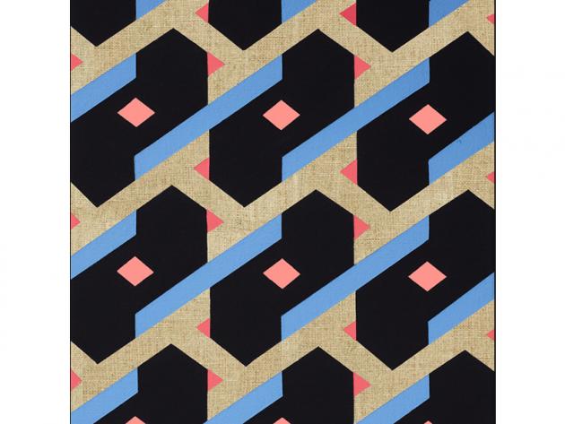
Here, she has divided the gallery space into three distinct areas. The front, with its immersive colour patterns, acts as a nod to Tantra’s public art practice (most notably a 300-metre painted bridge in Canary Wharf for the 2012 Olympics). Tantra creates a situation that fosters tension between the rigid and the flowing, the interior and exterior, colour and time. Clear pink vinyl is applied to the gallery window and as the sun shines through, pink shapes are cast over the front walls and floor; these move in time with the sun, ever changing, ever morphing to create new colour interactions on Tantra’s geometry. Inspired by the colour blocking techniques pioneered by such artists as Le Witt, Stella and Buren, Tantra’s bold patterns and prints are superimposed here with the contrastingly fluid nature of the pink light.
Within the main room of the gallery, we move from immersive pinks to blue hues, as the viewer is greeted with a large interior space in which are hung paintings Tantra developed whilst reading William Gass’ On Being Blue: A Philosophical Enquiry. Even here she creates tension, exposing the raw elements of the canvas. This contrast between paint and non-paint, smooth and rough, covered and bare creates a dialogue between the two and three-dimensional, highlighting the use of tessellation and pattern. Like Tantra’s public installations, these patterns are computer-designed; however, the contrast between these paintings and the more public façade of the front gallery is twofold – both in their dimension and presentation as well as their production. While Tantra’s large-scale public commissions involve teams of people, often working on an industrial scale, here the focus is on the textile aspects of decoration and craft, as each work is hand-painted.
Finally, within the gallery’s innermost space, Tantra presents us with a collage, or assemblage, of wall paintings, canvases and found prints. “I wanted this room to have a different feel to the previous one,” she explains. “This is more intimate, experimental, domestic – reflecting more on studio activity rather than a finished project.” These pieces include prints from James Audubon’s famous Birds in America folio, in which the colour used to illustrate these (then) new and exotic birds in itself reflected what was seen as the exotic nature of the New World – dangerously tantalising, different and sexual. In a sense, the room takes on a hybrid role: it is studio and Victorian parlour, Farrow & Ball paint in Pink Ground and Skylight hues ornamenting the walls, harking to good taste, class and heritage. The slick packaging and marketing of colour as a commodity very literally encases the less ‘finished’ pieces within it, a coalescence of finished display and collection of curios.
“Colour exists as an integral aspect to my work and I am drawn to it as a material which lies between the language of art and industry,” explains Tantra. “Colour exists within its own structure: it is densely packed, hermetically sealed, contained. My work takes on a sculptural approach to ‘colour collage’ where colour is ‘cut’ as opposed to filled, ‘layered’ as opposed to mixed, ‘constructed’ as opposed to emerged. Geometric boundaries are definitive and illusionary highs ‘snap’ into place as you walk around the work.” Here, in Fantastic/Chromatic, the viewer is led inside Tantra’s investigation of colour, at once a voyeur as well as a participant. The world of chroma, that vitality and intensity of colour, becomes tangible as it veritably immerses one in pink light, creating concord and discord, harmony and disruption – a sea of light and a world of colour.
A British artist of Balinese descent, Sinta Tantra was born in New York in 1979. She studied at the Slade School of Fine Art, University College London 1999–2003 and at the Royal Academy Schools 2004–06. Her site-specific murals and installations, many in the public realm, have been exhibited at the Southbank Centre, Liverpool Biennial, the Royal British Society of Sculptors and Transport for London.
Sinta Tantra: Fantastic / Chromatic – Kristin Hjellegjerde Gallery – 11 September to 10 October 2015