On entering the ground floor gallery at Tate Liverpool, I look around and see eleven works by the American artist Ellsworth Kelly, three of which I recognise and one that seems familiar from the cover of one of my art books. I am enjoying being surrounded by such bright colours, some of which are in fluorescent oranges, different shades of blue, red, white, black and much more. I found they actually had a serene effect upon me which is unusual for such vibrant colours. I decided to choose a painting that caught my attention and think about it without knowing about the work.
There are no identifiable rules of observation when it comes to looking at the work
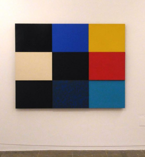
Looking around I am drawn towards the second painting on the left as I enter the room, a painting containing nine coloured rectangles. Looking at it from a distance it catches my attention because of its optical illusions on the eye. It seems to me that a white rectangle is slightly jutting out of the canvas. I am not sure if it is relief or flat. The red rectangle also seems to be jutting out and the middle blue rectangle on the bottom row. Intrigued, I am now going to find out the truth. I walk towards it and as I get close up, I discover, the rectangles are in fact jutting out. This interests me because I was initially thinking that the whole piece was possibly a flat surface with an optical illusion. Normally when I see paintings like this, I move closer and discover that the paintings are actually flat and there are no relief shapes to them.
I begin to explore the surface of this painting, checking to see if I had observed it correctly. Even looking closely, there is a feeling of not being entirely sure. This painting is titled Méditerranée, 1952. Oil paint on wood. It was Kelly’s first purely abstract relief, ‘a wall- mounted sculpture with three – dimensional elements. Kelly experimented with processes of chance to determine the colour combinations.’ I do love this idea of chance. I think it takes away much of the fear for many people when approaching abstract painting. There are no identifiable rules of observation when it comes to looking at the work. It is more about engaging and exploring relationships of colour. This playfulness is very exciting and opens the mind to the possibilities that colour exploration and form can create and inspire.
I am now seeing this piece as a relief sculpture, much the way I look at a classical relief sculpture. If you have seen classical Greek relief sculptures of figures then this is in some ways similar, although the process and medium are different. Now I am wondering about the title Méditerranée. You can allow your imagination to explore each colour and relate to the imagery it conjures for you. For me, I feel this could resemble any time or place within the Mediterranean. Which rectangle am I drawn towards? I like the yellow one. This rectangle is not in relief but the fact that it stands out for me more than any other colour highlights the interesting balancing of relief against a flat surface. It makes you wonder if you would have preferred the yellow rectangle if it had been in relief rather than flat surface. I am thinking about the Mediterranean and Kelly’s approach to colour, form and atmosphere.
It is time for me to find out more about this artist. Ellsworth Kelly was born in 1923-2015. It is interesting that this artist has lived across a huge expanse of art history. ‘His singular approach to abstract painting reveals an enduring concern with the experience of looking at art itself as a subject.’ Kelly was born in New York and studied painting at the School of the Museum of Fine Arts in Boston. He began his career as a figurative artist, during the second world war and he served in the US Army’s camouflage unit, later applying the methods and research employed there to introduce colour and coding techniques into his painting.’ So I now have an idea of where his method derives from. It is interesting to think that he has taken his working skills from being in the army to use within his art. I find this fascinating. I always enjoy this idea of relating one’s works experience to art. Another artist who went down a similar route by using his work experience to influence his work was Andy Warhol who was a commercial Illustrator and Graphic Designer.
In 1948, Kelly moved to Paris, where he was introduced to artists such as Mondrian, Brancusi and Arp. Kelly used the works around him such as people he observed in life and photographs to inspire his shapes and forms. He had an interest in the city and this became his source. In 1964 he returned to New York where he worked on large-scale paintings, prints and sculptures. Kelly conceived ‘paintings as objects in themselves and fragmented perceptions of things, his approach contrasting with the gestural, vigorously traced brushstrokes found in abstract painting.’
The works in the Tate exhibition are so minimal and abstract that it is hard to not wonder what was going on in Kelly’s mind as he created them. There are a set of four lithographs in the exhibition called The Mallarme Suite, 1992. Kelly had initially made eleven prints to illustrate a new edition of the French poet and critic, Stéphane Mallarmé’s poem, Un Coup de Dés Jamais N’Abolira Le Hasard, ( a roll of the dice will never abolish chance). ‘Its intimate combination of free verse and unusual typographic layout anticipated the 20th-century interest in graphic design and concrete poetry.’ Kelly’s set of four prints were published separately. Mallarmé arranged the words of the poem and the spaces between them in unusual ways across double-page spreads, experimenting with the relationship between form and content. Each of Kelly’s prints draws on specific details he observed in the text. This dual interaction is an interesting process and draws our attention to the interlinking connections between visual art and experimental poetry.
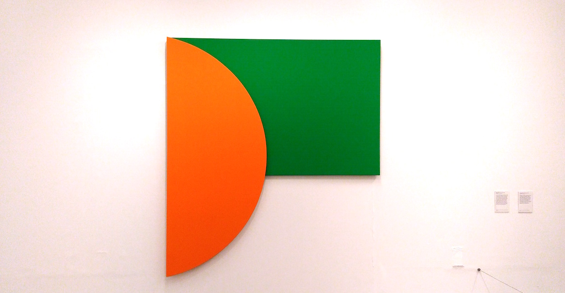
It is impossible to avoid Kelly’s paintings. They entice you in. In particular, his painting, Orange Relief with Green. 1991. Oil paint on canvas. This is a two-panel painting combining a large orange crescent with a green rectangle. It is very beautiful and reminds me of the sun setting over a landscape. There is something primitive and ancient about this piece. This painting is full of warmth, heat and serenity. Kelly was interested in ‘combining stable, straight-edged forms with dynamic, curved forms.’
In contrast, the cool painting titled, Black Square with Blue 1970 oil paint on canvases has a cold penetrating mysterious quality. There is something architectural about it and reminds me of aspects of the city. It was at this time that Kelly experimented with unconventional arrangements of shapes. ‘This strategy advanced his aim to create objects which interrelated with their surrounding space.’
Kelly’s painting, Blue, Black Red, 2006 uses horizontal rectangular panels joined in a vertical shape and shows his interest in a sequence reflecting his direct visual experience, whether man-made or the natural environment. Kelly’s painting Red White 1966 conveys a more organic painting combining hard and soft forms to create dynamic compositions.
I would recommend going to see this exhibition of one of America’s greatest abstract painters of the twentieth century. This is a free exhibition.
ELLSWORTH KELLY IN FOCUS is on UNTIL 29 MAY 2017.
Review/photos by Alice Lenkiewicz © Artlyst 2017